Colour Palettes to Look Out For in 2026
Part science, part mood: the house's own view of the palettes to watch in 2026 — ink and ivory, liquid metals, deep jewel anchors and grounded warm neutrals.
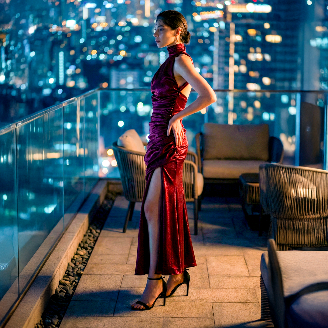
Colour forecasting is part science, part mood — a reading of where culture, design and desire seem to be heading. What follows is the house's own view of the palettes we find ourselves drawn to for 2026: not rules, but the colours we believe will feel right. As always, read them as a point of view, not a prescription.
Ink and ivory, still
The strongest palette is the one that never dates. Black and a warm off-white remain the foundation of everything we make, and 2026 only deepens the case for restraint. As trend cycles accelerate, the confidence of a strict two-tone — ink and ivory, nothing else — reads as the ultimate luxury: a woman who has nothing to prove.
Liquid metals
Chrome, pewter and liquid silver feel increasingly current — a cool, modern, almost technological shine that pairs naturally with the house's clean lines. Expect metallics to move away from festive gold and toward these disciplined, architectural silvers, worn as the single statement in an otherwise quiet look.
Deep jewel anchors
Where colour appears, we see it going deep rather than bright: bordeaux, oxblood, forest, midnight and aubergine. These saturated, grown-up tones carry occasion without noise, and they photograph with a richness that pastels and primaries cannot. One deep jewel, worn head to toe, is a whole look.
Grounded warm neutrals
Beside the darks, a family of warm, earthy neutrals — clay, stone, bronze, mushroom, oat — feels quietly important for 2026. They flatter every skin tone, sit beautifully in daylight, and give the restraint of neutrals a little more warmth and humanity.
How to actually wear a "trend colour"
The mistake is chasing a colour because it is current. The house approach is the opposite: choose the one colour of the season that genuinely suits you and the occasion, then commit to it fully and keep everything else quiet. A palette is only worth following if it makes you look better — never the other way round.
See how these tones translate into pieces across the Signature Collection.